CASE STUDY 05
INNOVATION
SCAFFOLDING
THE PROBLEM
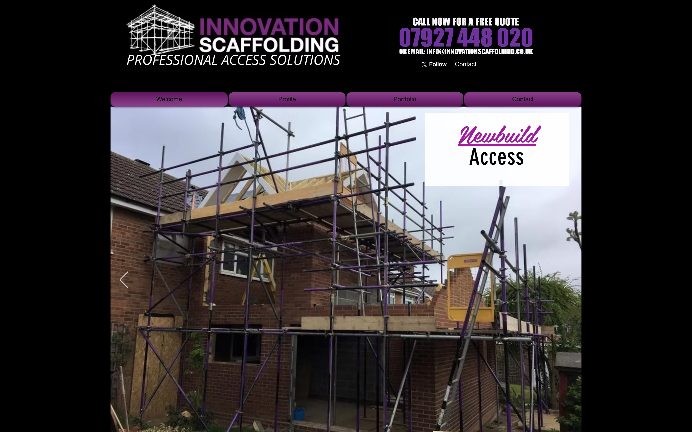
A scaffolding firm that erects for English Heritage and the University of Cambridge, with purple-painted tubes you can spot from the end of the street. None of that reached the website: the partners sat on a back page, and the credentials on the boss's business card, CISRS registration, full insurance, a 24 hour emergency line, weren't on the site at all.
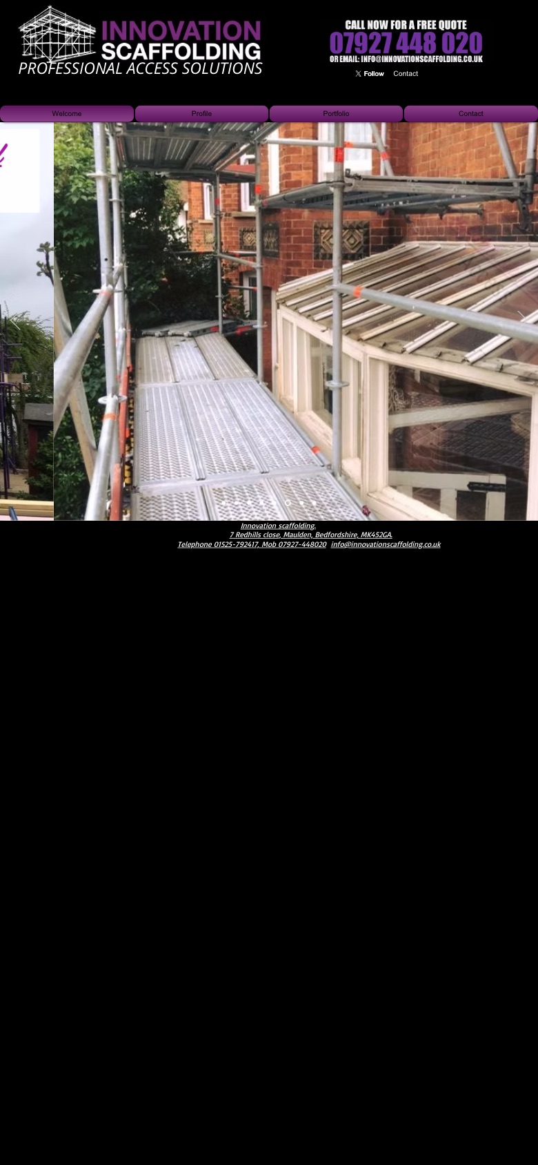
The Wix site went up in the firm's early days and nothing had been touched since March 2018. That's what happens when the work keeps coming: scaffolds go up around the UK and nobody has a reason to look back at the website. Meanwhile it had spread to thirteen pages, hauled in through 152 requests and 22 scripts, with a seven-category portfolio that was mostly empty shelves.
WHAT WE DID
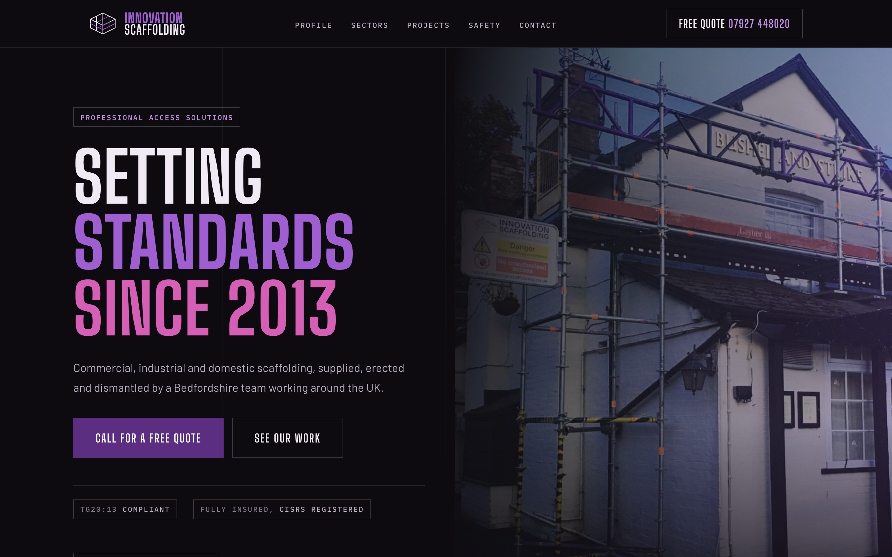
The brand was already there, on the kit. Purple tubes, black signage, thirteen years of jobs photographed as they were finished. The rebuild takes what's painted on the scaffolds and puts it on screen: dark, industrial and unmistakably theirs, with their own wording carried over and trimmed, nothing invented.
- The business card, on screen one. TG20:13 compliant, CISRS registered, fully insured, 24 hour emergency service. It was all true before, it just wasn't on the website.
- The partners out of hiding. English Heritage, University of Cambridge, GKN Aerospace, Amey PLC. Names that win commercial tenders, moved from a back page to the first scroll.
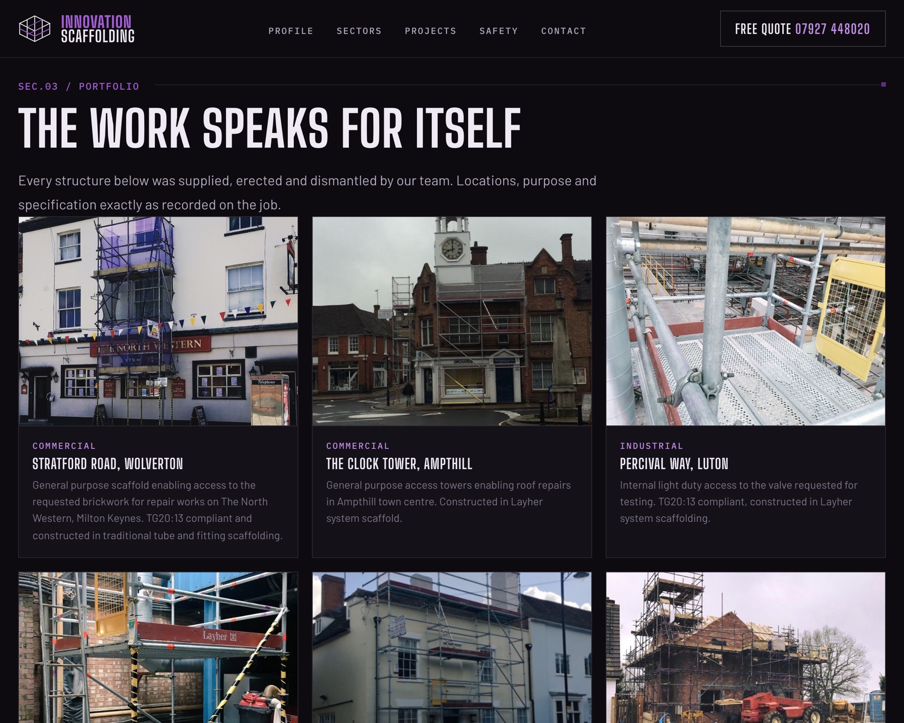
- Fifty seven jobs, on the record. The mostly-empty seven-category portfolio became a filterable archive of every photographed job, each with the location and spec exactly as recorded.
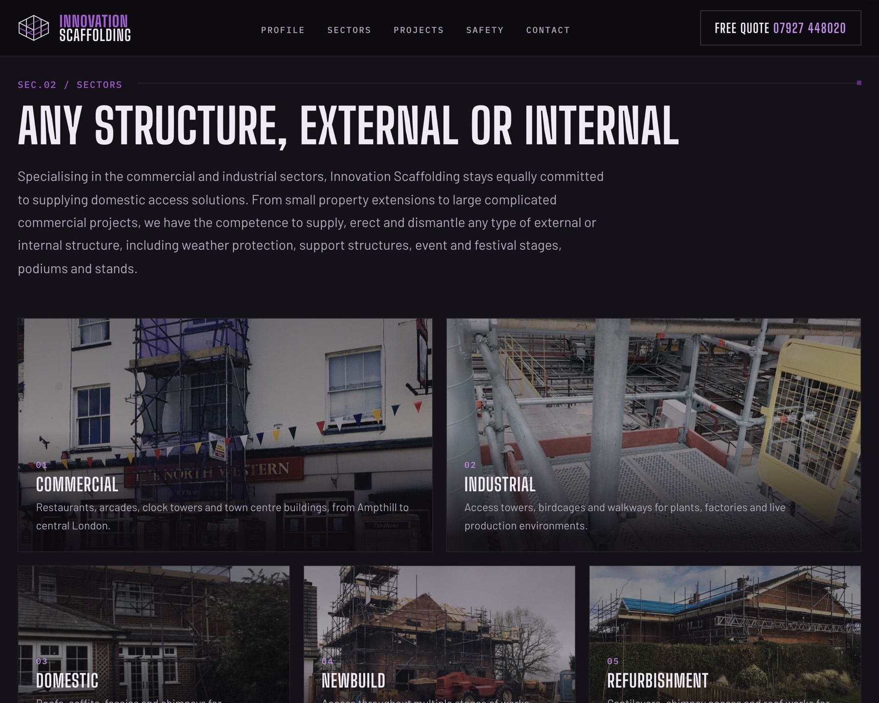
- Thirteen pages became two. One page that sells, one archive that proves it. No page on the site is thin any more.
- Zero scripts. The old homepage loaded 22 of them. The new one is plain HTML and CSS: nothing to break, nothing for Google to guess at.
- A number you can't lose. Free quote button pinned to the header on desktop, a call bar pinned to the bottom on a phone. Scaffolding is a phone call trade.

THE RESULT
On a phone, the old site served the desktop page shrunk down, with the content running off the edge of the screen. The new one is built for the pocket it gets read in, with the quote line one thumb-tap away on every page.
Two pages, 57 jobs, no platform, no scripts and no yearly platform bill. Thirteen years of standards, finally set on screen too.