CASE STUDY 01
RUSHTON
ELECTRICAL
THE PROBLEM
Scott and Danielle Rushton run one of the best-reviewed electrical firms in Bedfordshire. Fifteen years on the tools, NICEIC approved, and over 150 five star Google reviews. Their website was a 2021 Wix template: a wedding-invitation serif floating over a washed-out photo, three thin pages, and not a single review anywhere on it.
The proof that wins jobs was invisible. The accreditation that builds trust was buried. And the phone number, the whole point of the site, was a line of small text in the corner.
WHAT WE DID
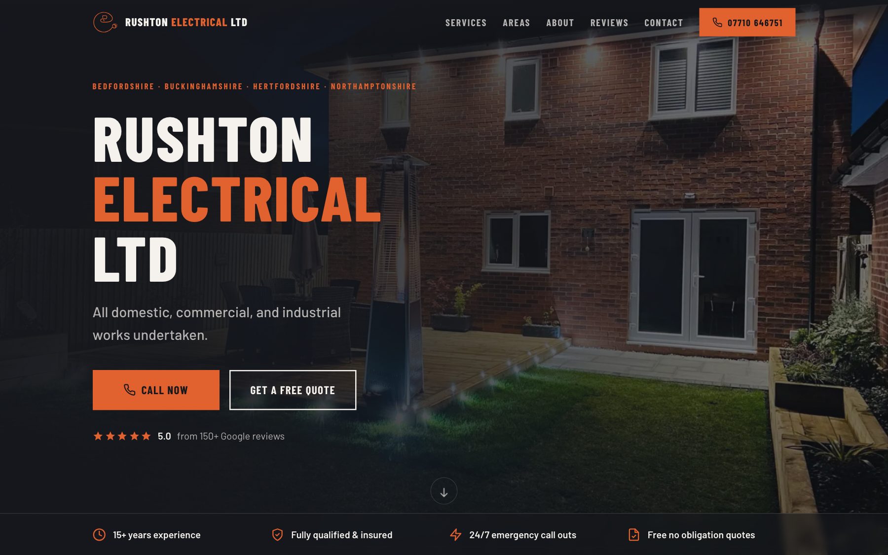
We started with what they already owned: the logo. We traced it into a crisp vector and pulled the brand from it, charcoal and hard-hat orange, so the new site looks like their vans, not like a template. Then we rebuilt everything around one job: turning a visitor into a phone call.
- A reviews stage. "Rated 5.0 on Google" as a headline, real quotes underneath, and a link to the rest. The best sales copy they own, finally doing its job.
- Trust up front. NICEIC badge, years on the tools, fully insured, 24/7 call outs. In the first screen, not the small print.
- Every service written up properly. Rewires, consumer units, EV chargers, fault finding. Each with its own plain-English copy, so customers and search engines both find it.
- An areas-served map. A 30 mile radius around Stewartby with every town named. Local search loves it and so do customers checking "do they come to us?"
- Built for phones. Most of their customers arrive on a mobile with a problem. The call button sits one thumb-tap away, always.
- One fast page. Hand-built, static, no platform bloat. It loads before the kettle's even on.
THE RESULT
A site that finally matches the firm behind it. Their reputation is on show, their accreditation is unmissable, and the number is always in reach. Launched 2026, built once, owned outright.